


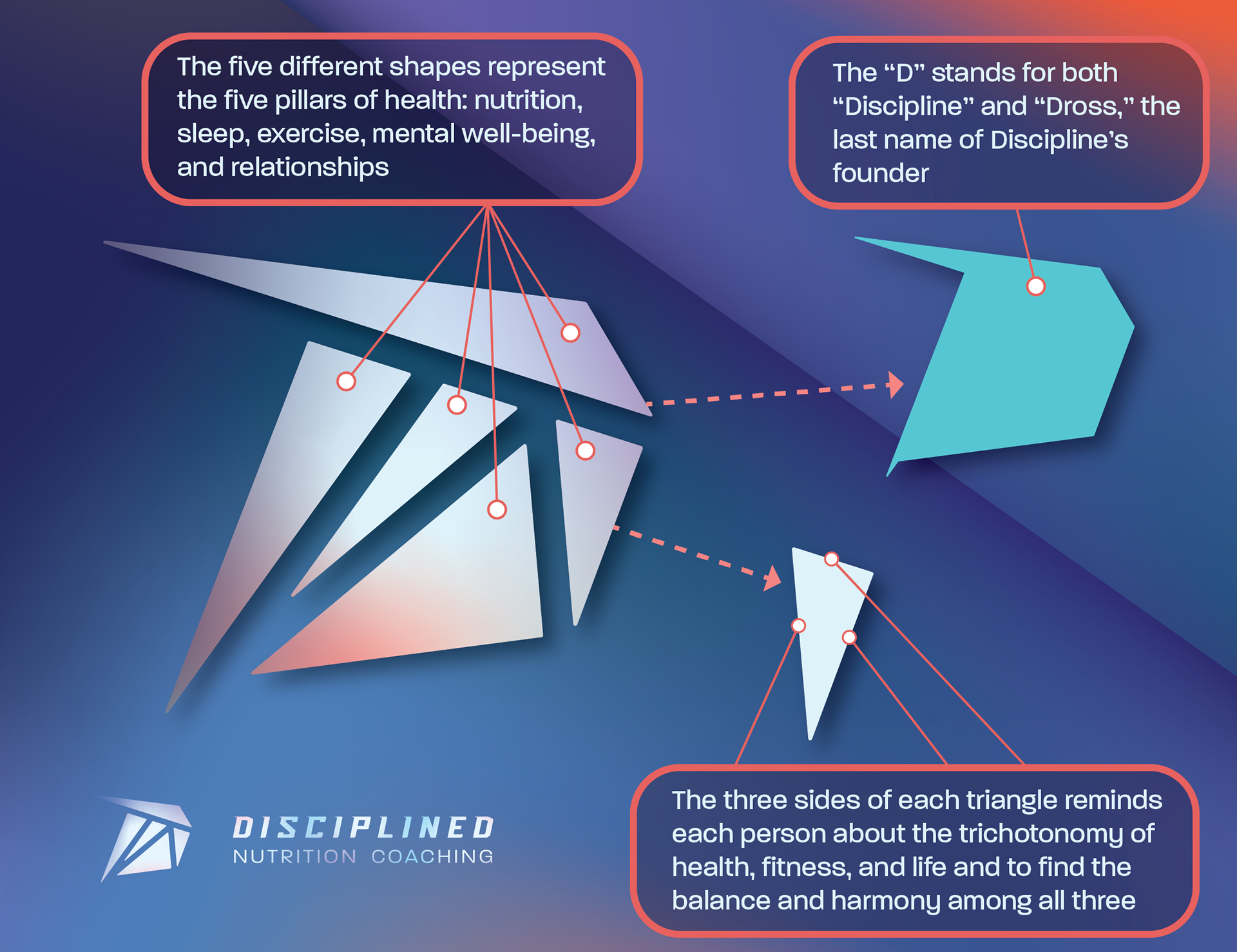
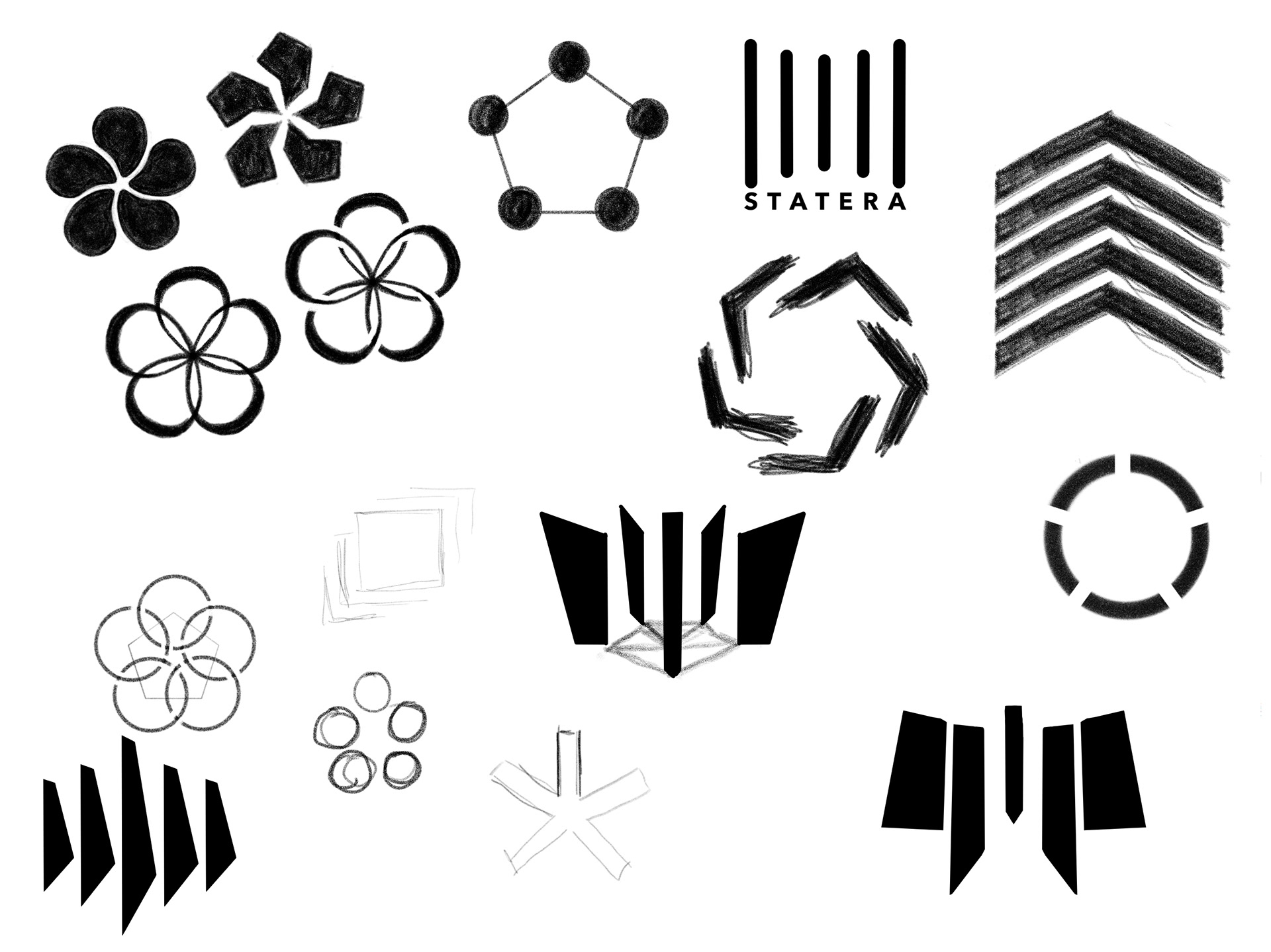
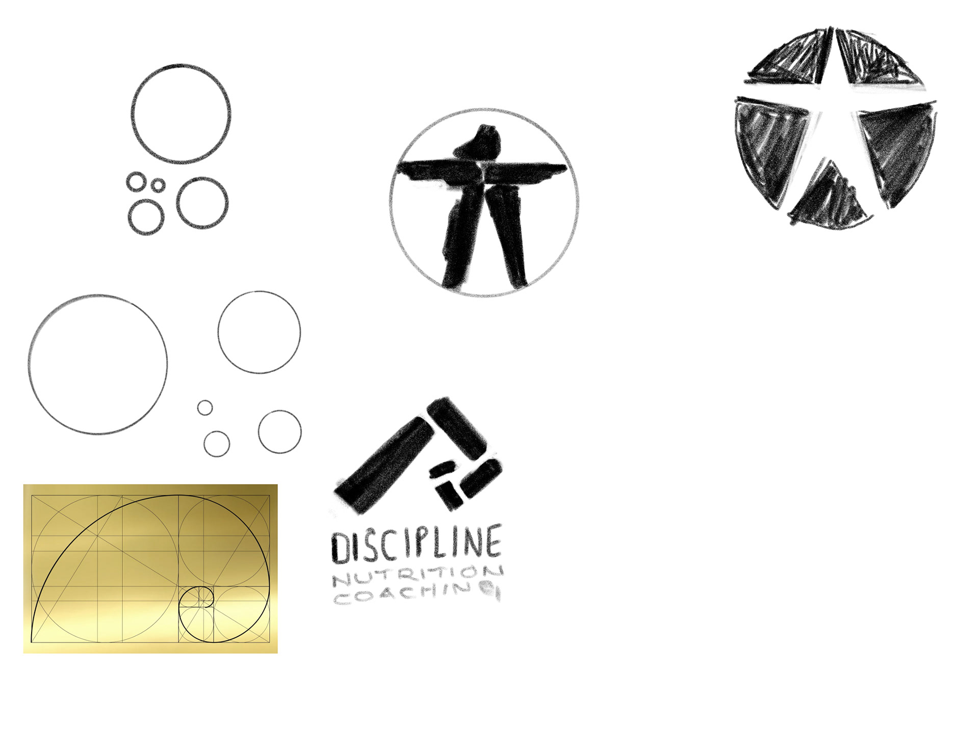
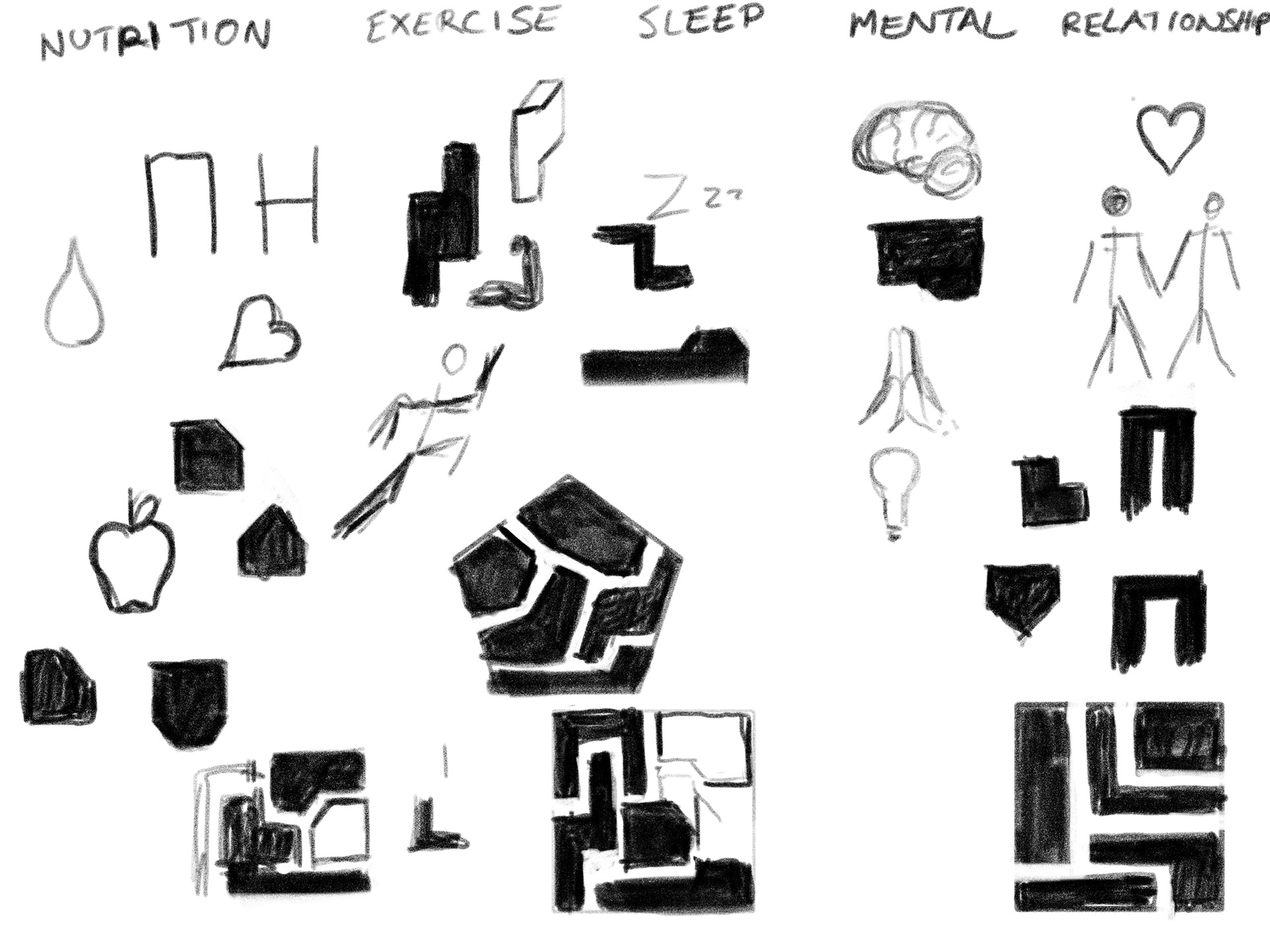
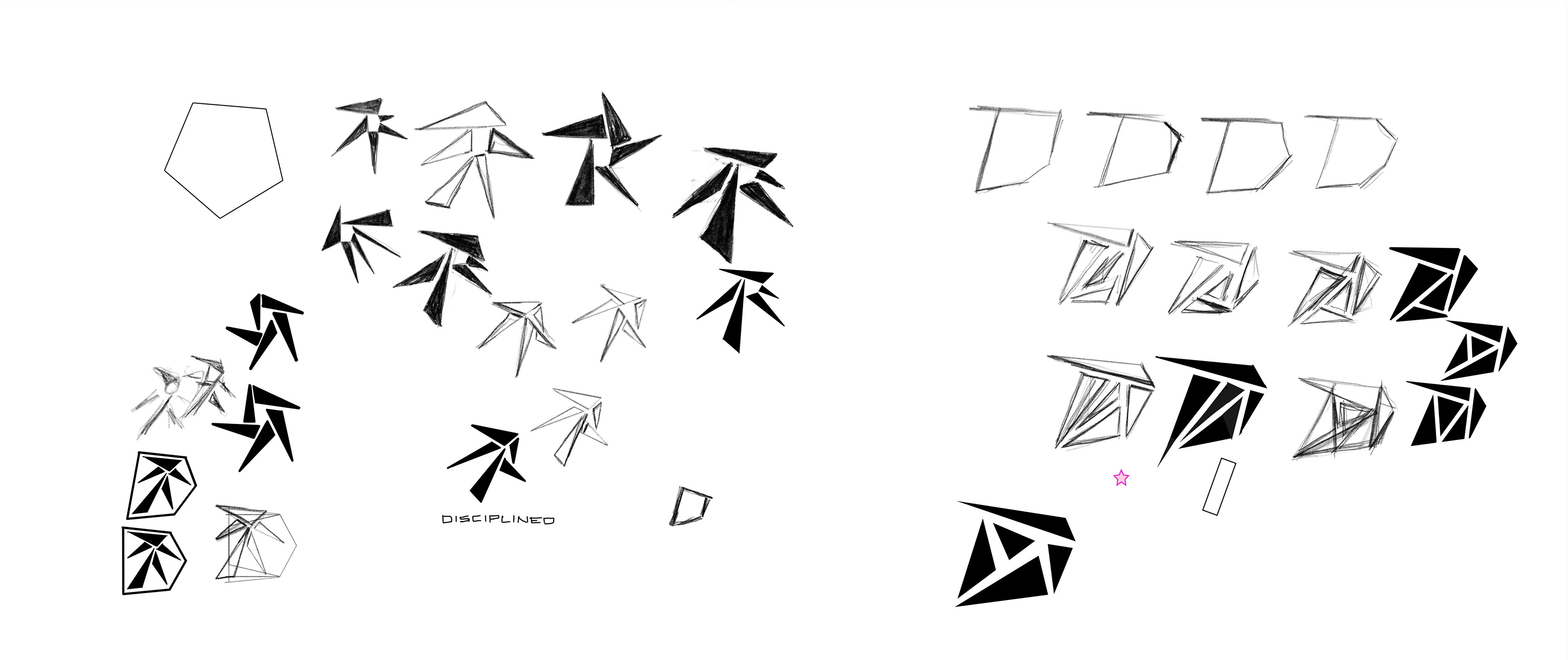
The client was looking for a brand that represented a combination of character traits. The target audience for this coaching practice is performance athletes and people who are serious about their health and wellness. One of the key tenets of Disciplined Nutrition Coaching is emphasizing the five pillars of health: nutrition, sleep, exercise, mental well-being, and relationships. Another important aspect is finding balance between health, fitness, and general life. So a brand identity was created that combined these elements:
1) a serious, athletic vibe to represent the client's style of coaching and to appeal to the target audience
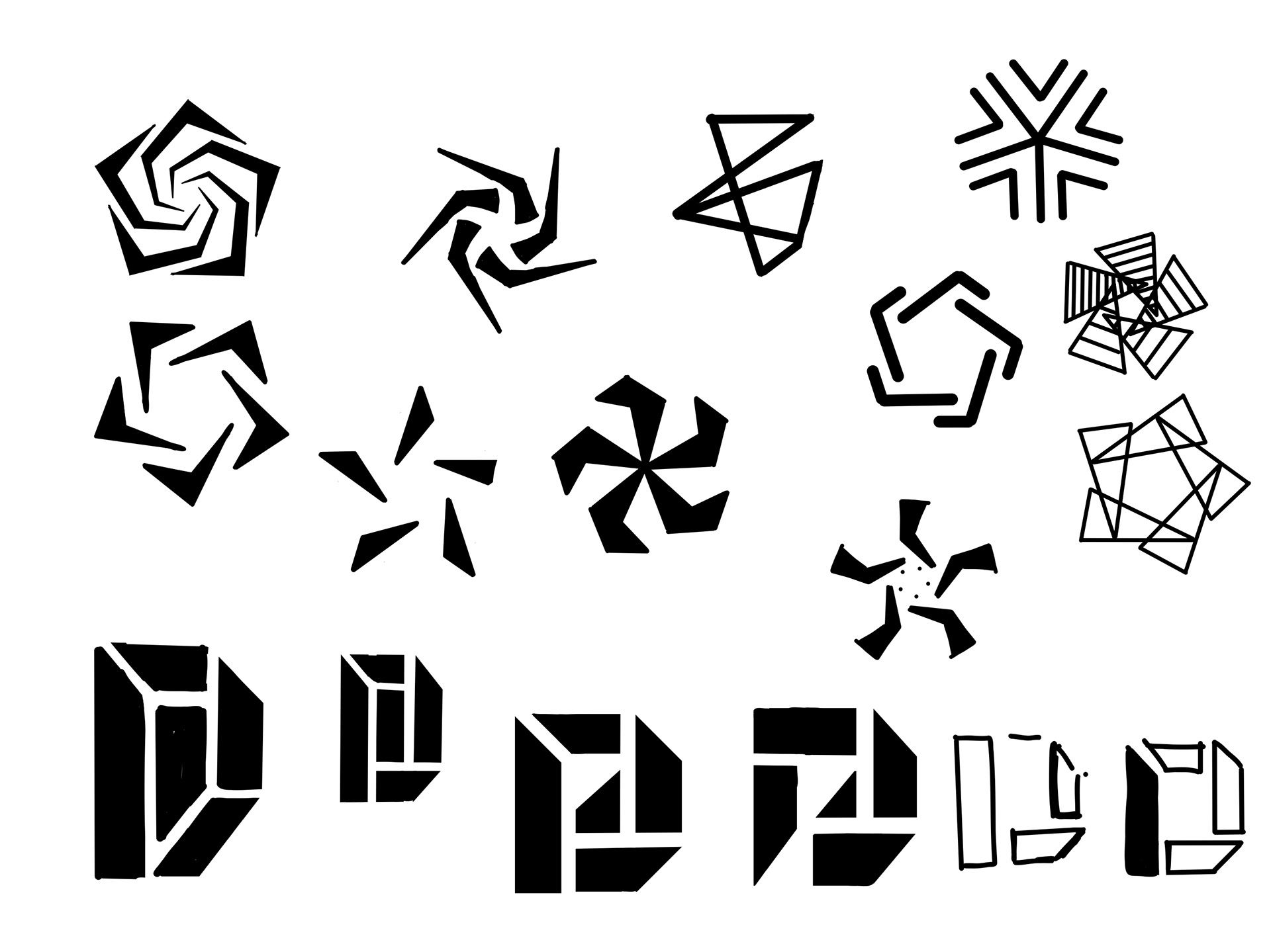
2) design elements that represented the 5 pillars of health
3) a softer interior to represent the harmony and balance between health, fitness, and life
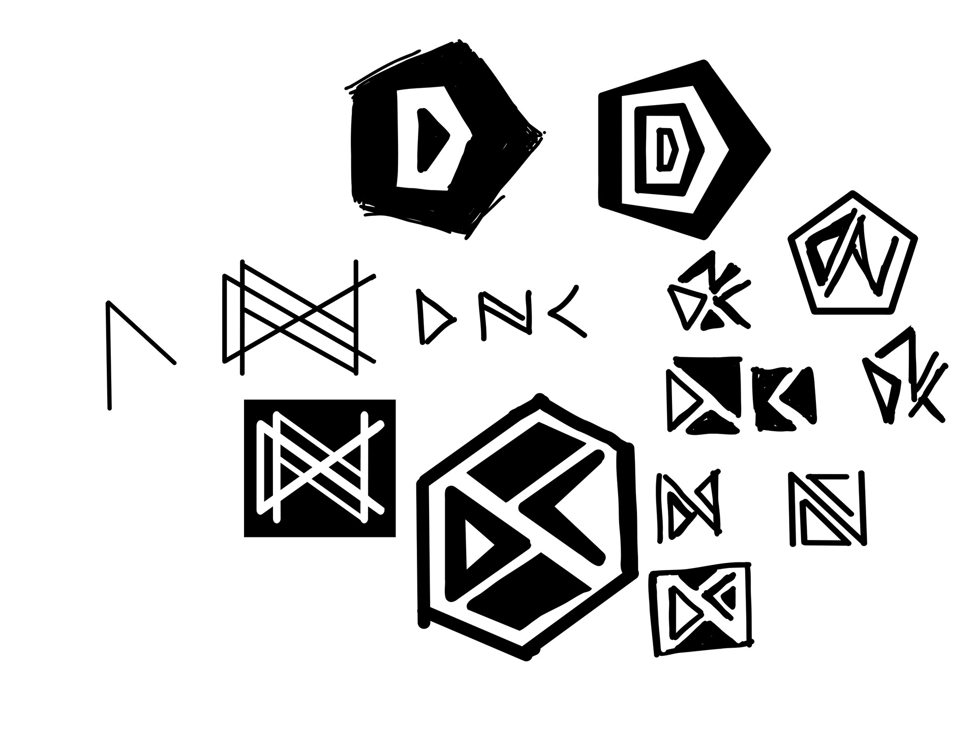
4) something that hinted at the name "Disciplined" (the client wanted to stay away from the acronym "DNC" and instead was intending to just use "Disciplined" as a shorthand title for the practice)
The following pictograph was created:
Branding Identity Elements
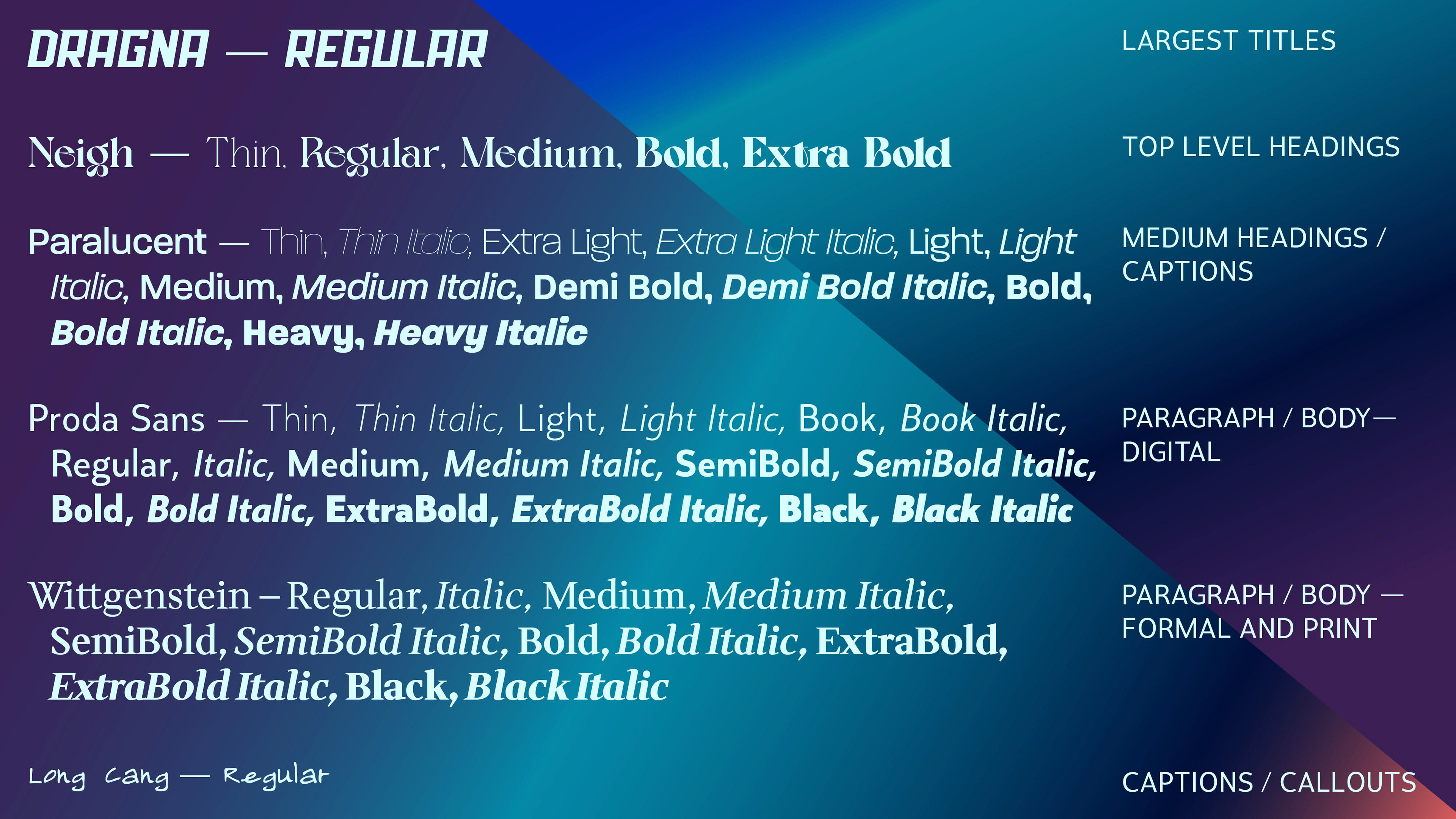
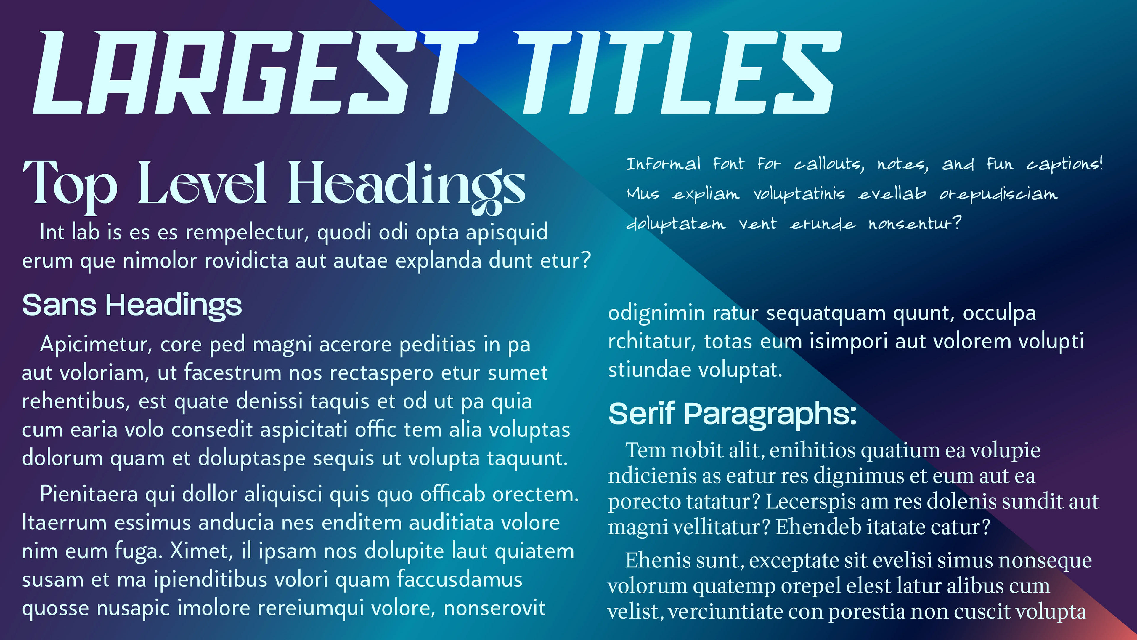
Typography
Colors

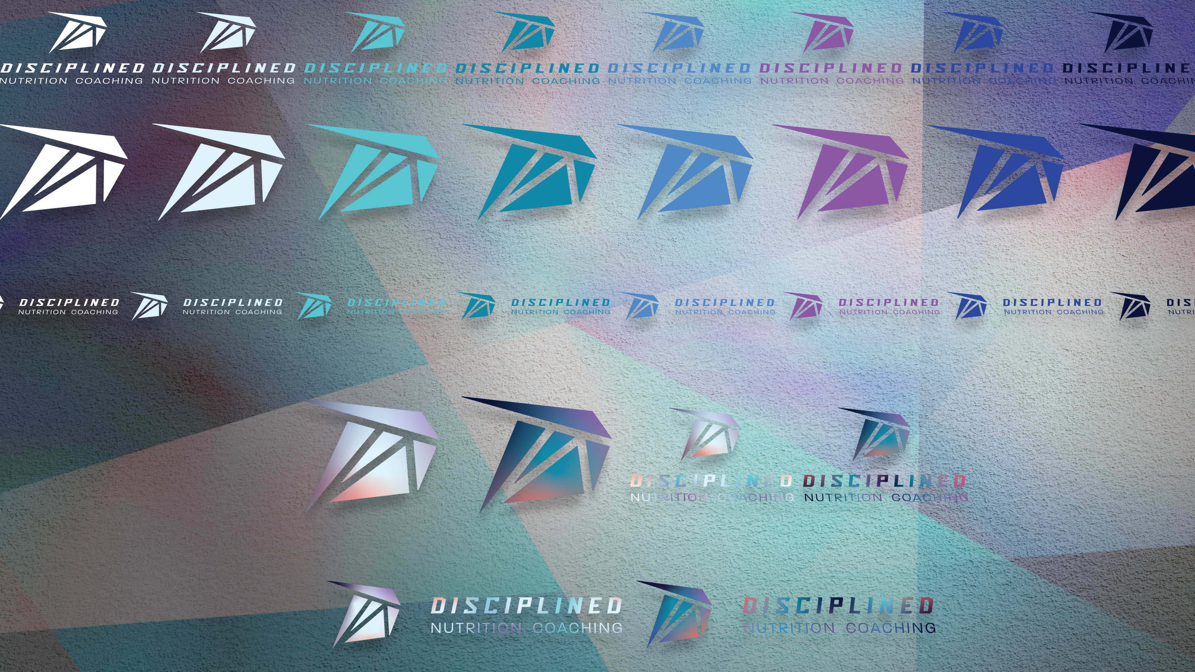
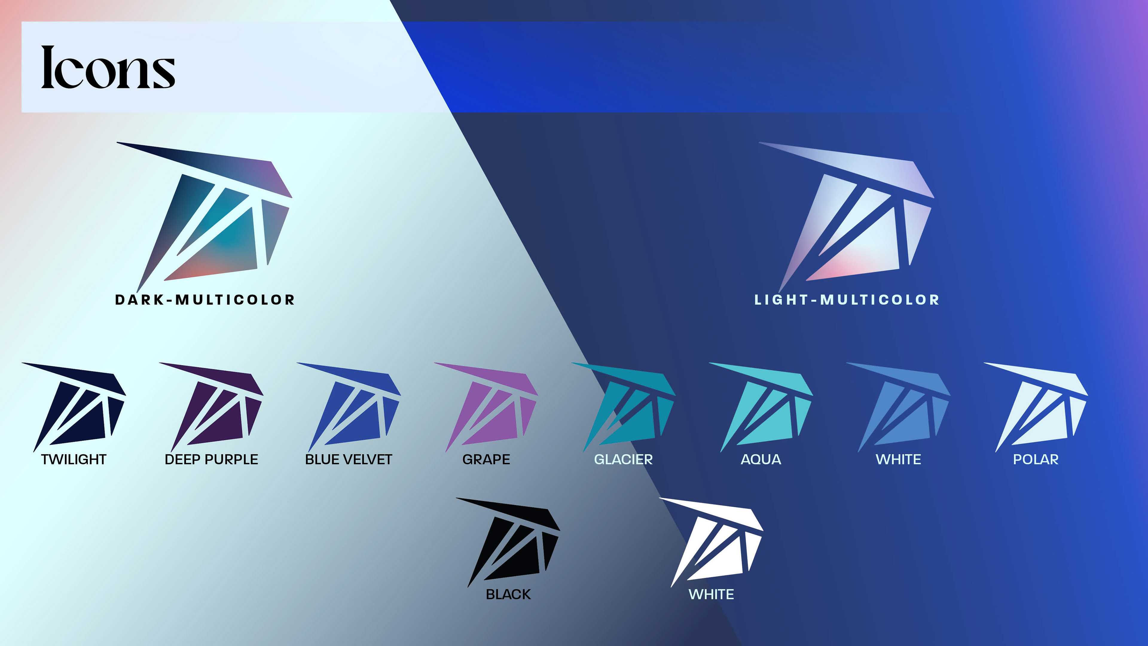
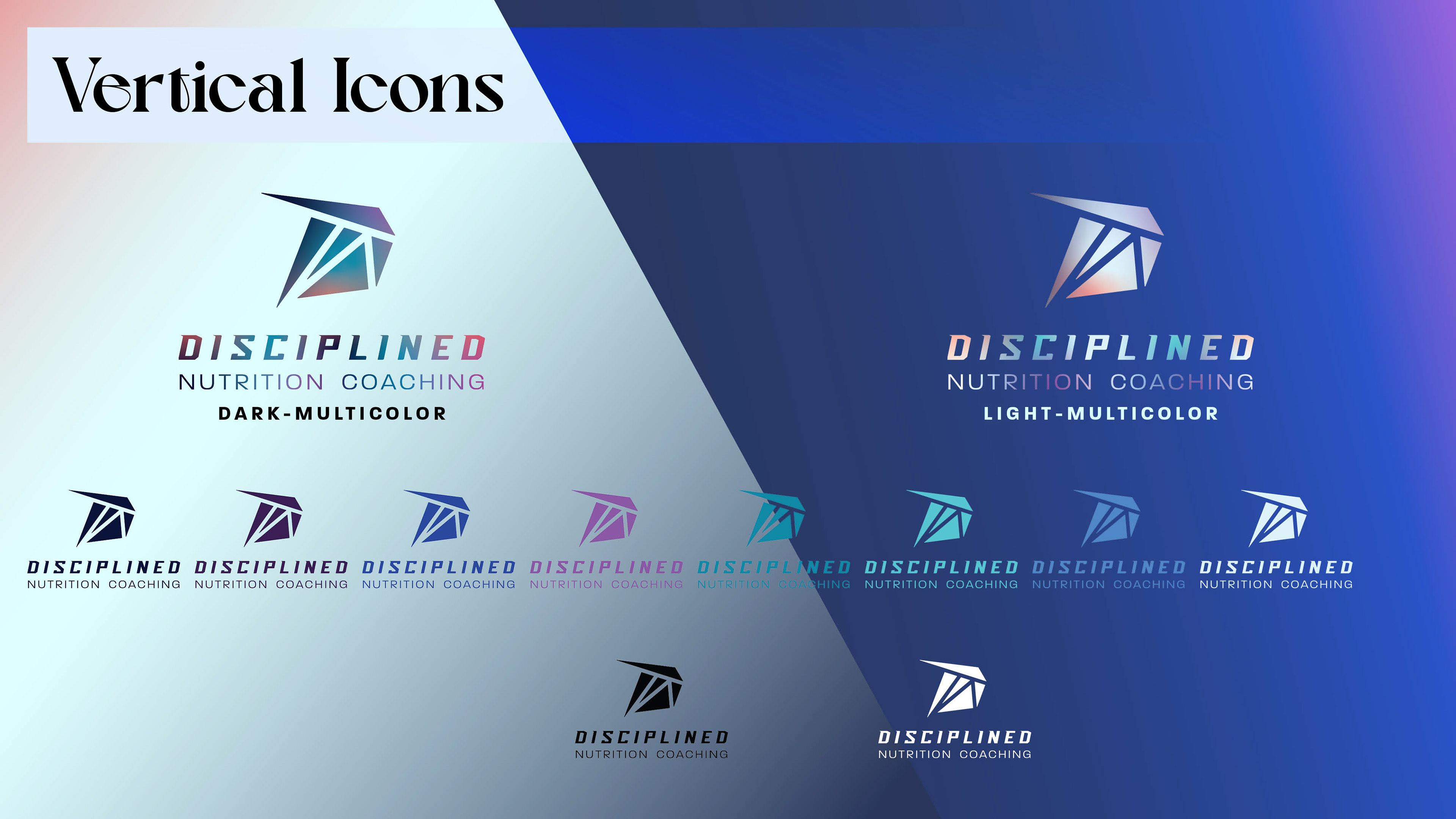
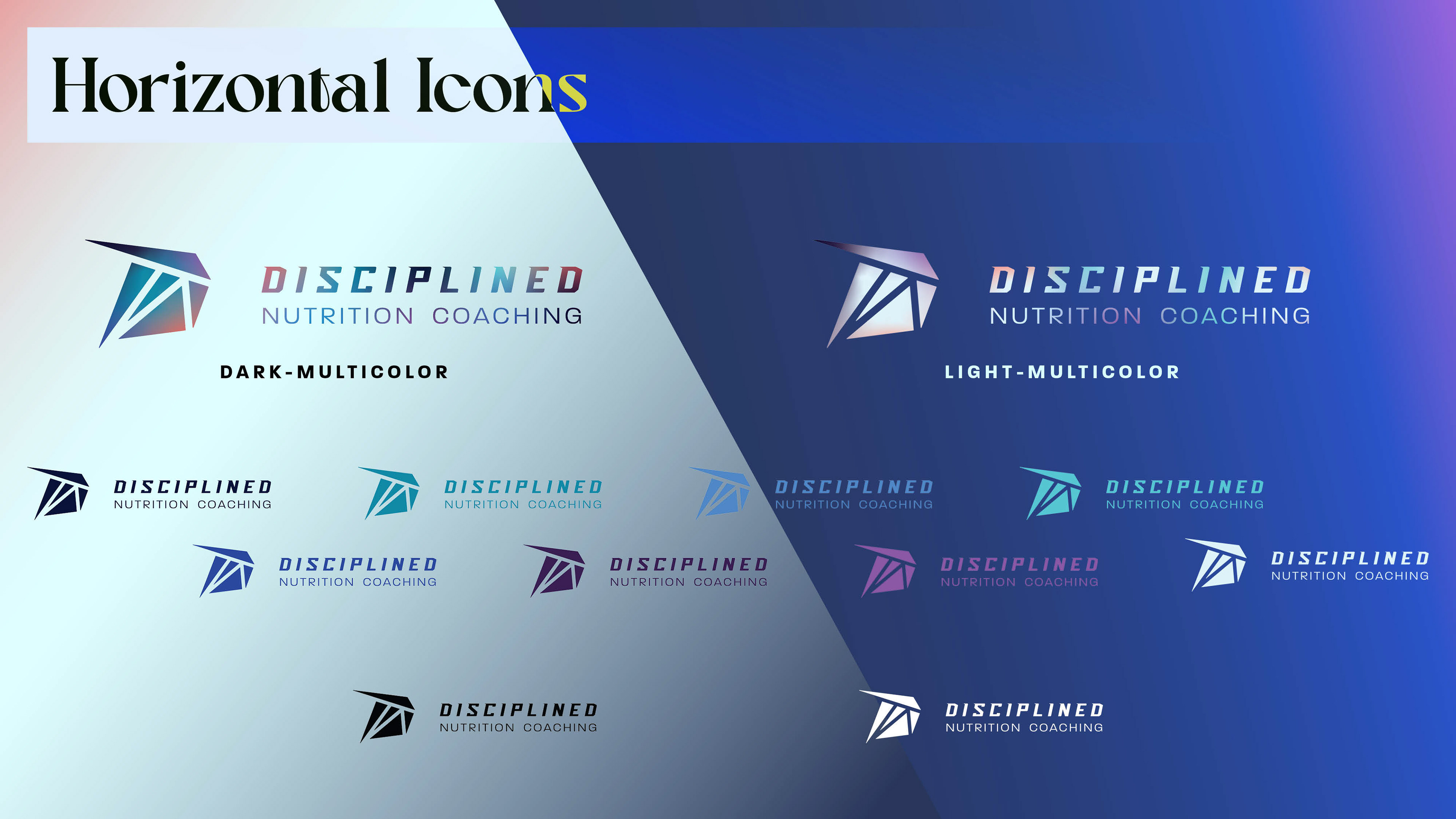
Logo and its variants
Other design assets
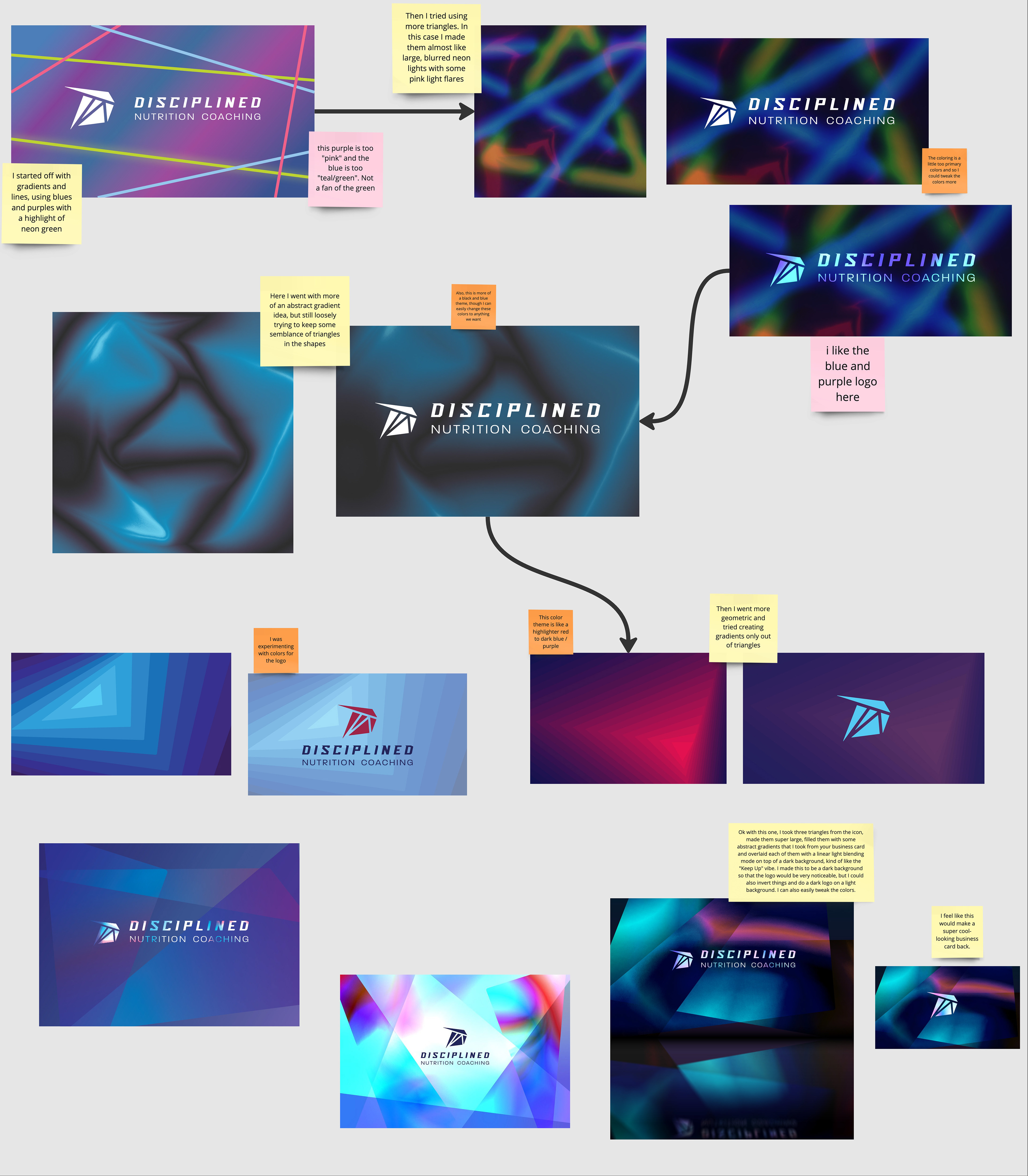
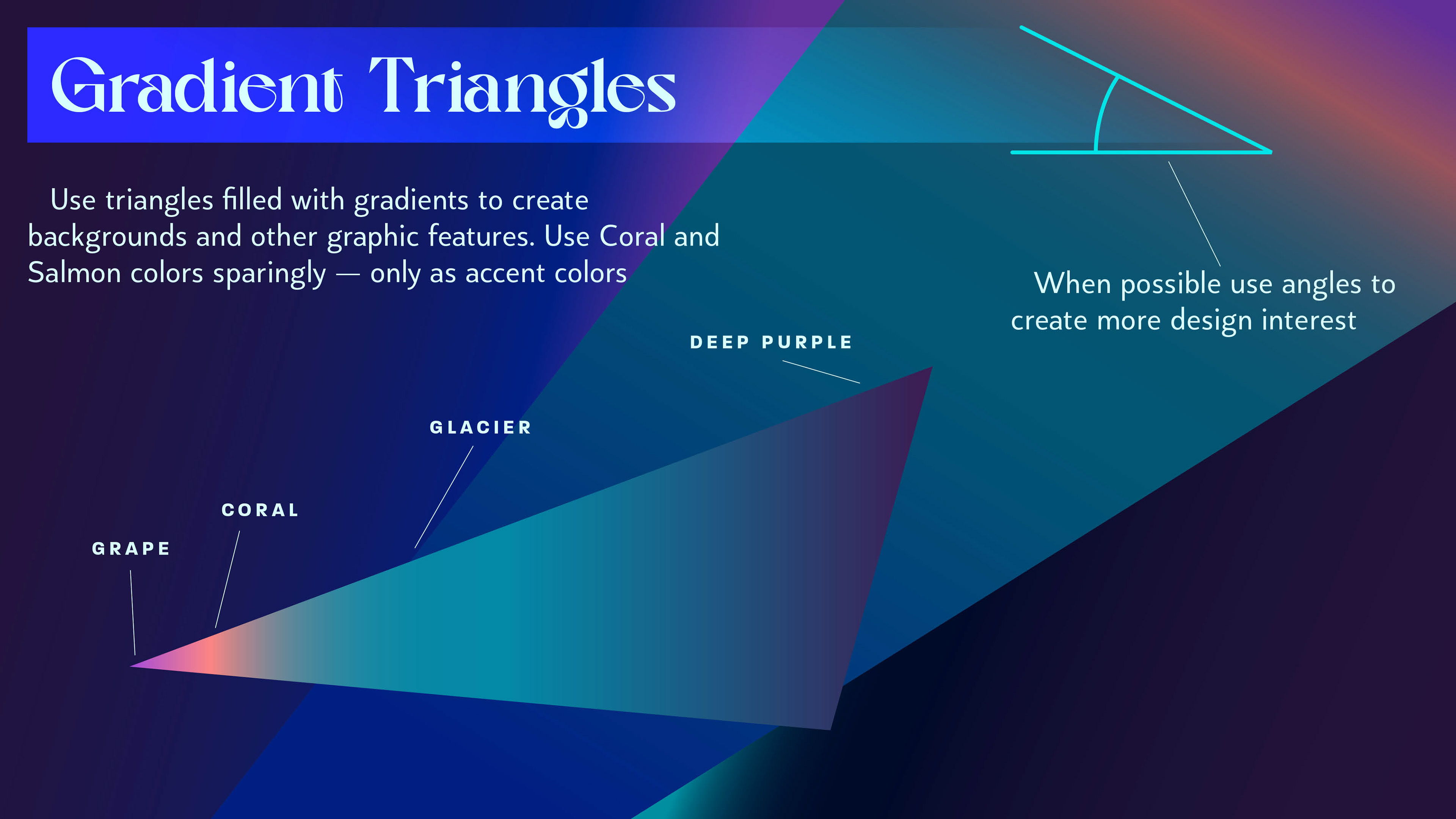
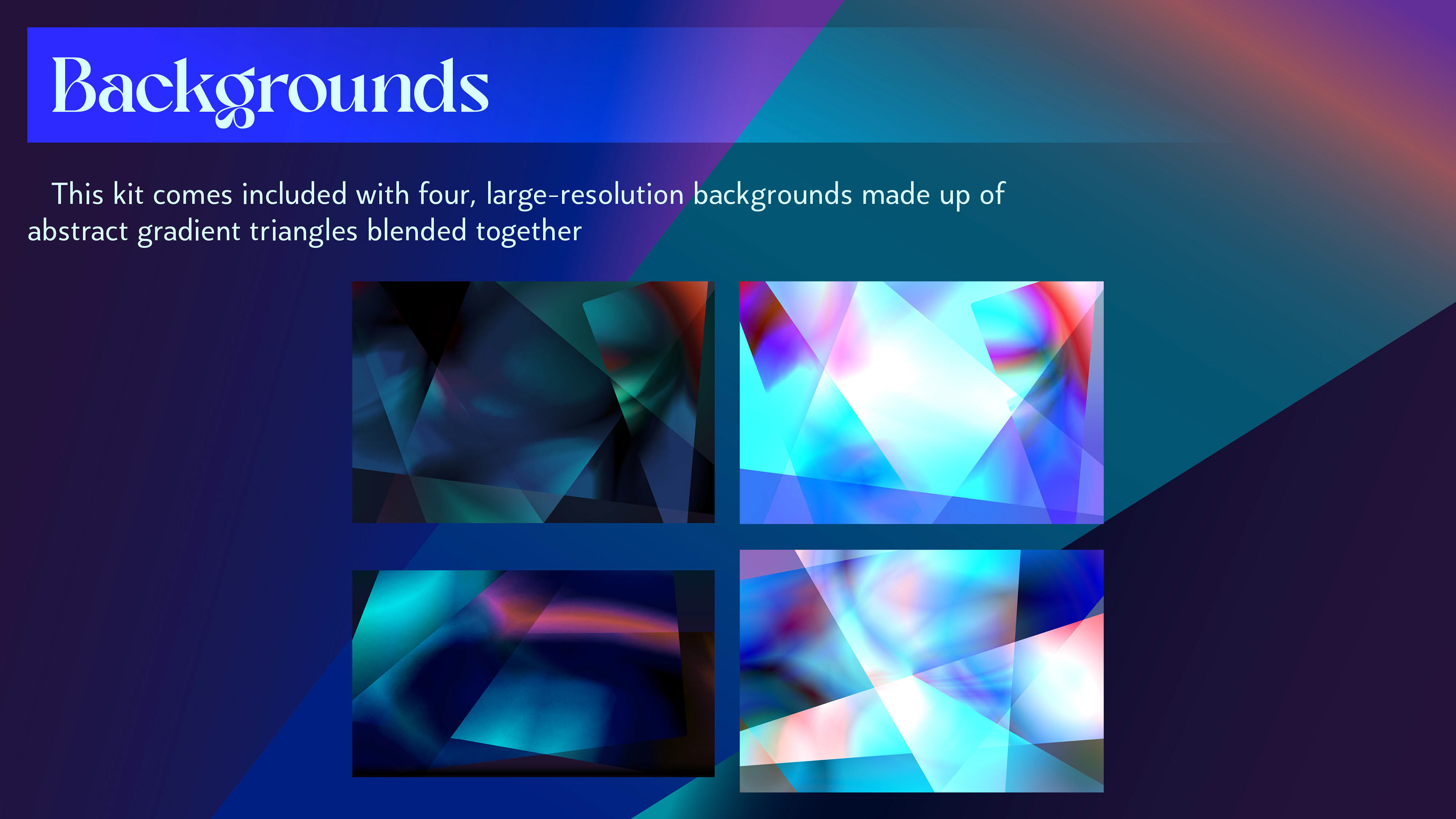
To create the more "serious" side of the identity, triangles were chosen, but to represent the "softer," "harmony and balance" side of the identity, gradients were chosen. Combining these two, triangles filled with gradients, creates the overall style and aesthetic of the brand.
Branding Identity Elements
Initial concepts
Revisions
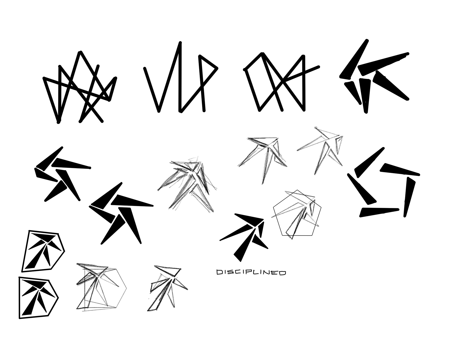
Style and Aesthetic Concepts