

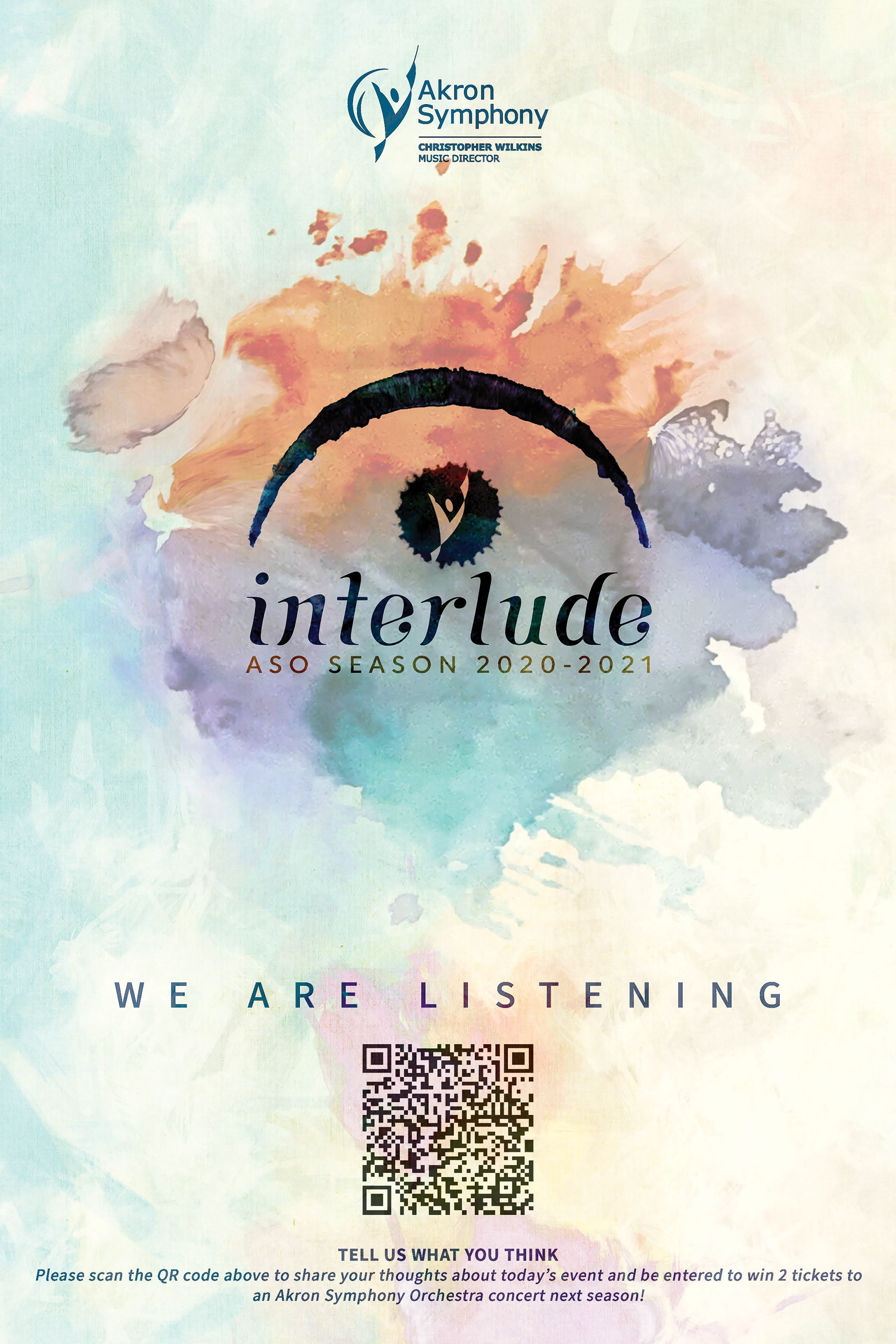
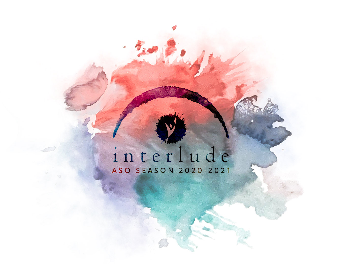
Akron Symphony Orchestra
Interlude Season 2020-2021
Branding / Logo Design / Poster Design
During the Covid-19 pandemic, the Akron Symphony Orchestra (in Akron, OH) introduced their 2020-2021 season as "Interlude Season." In lieu of traditional concerts in E. J. Thomas Hall, they produced a number of different performances and musical presentations including online performances, instructional presentations, and small performances of 2-6 people in various venues throughout the city.
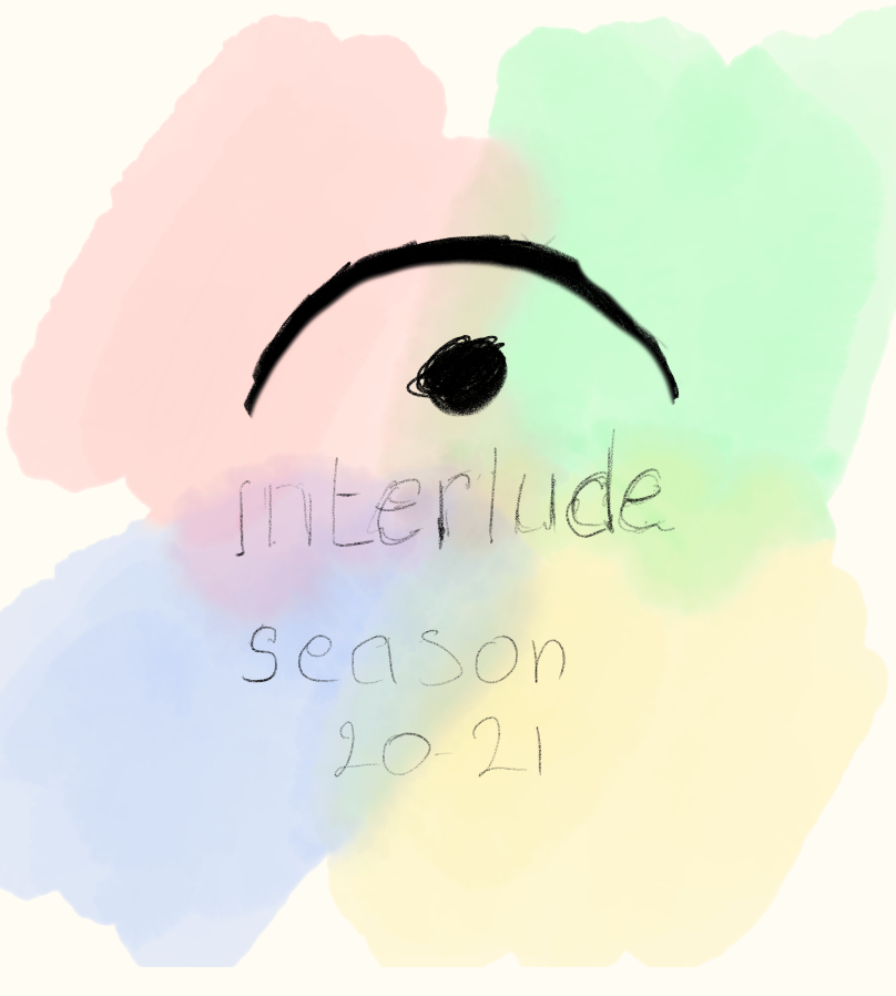
Logo Elements
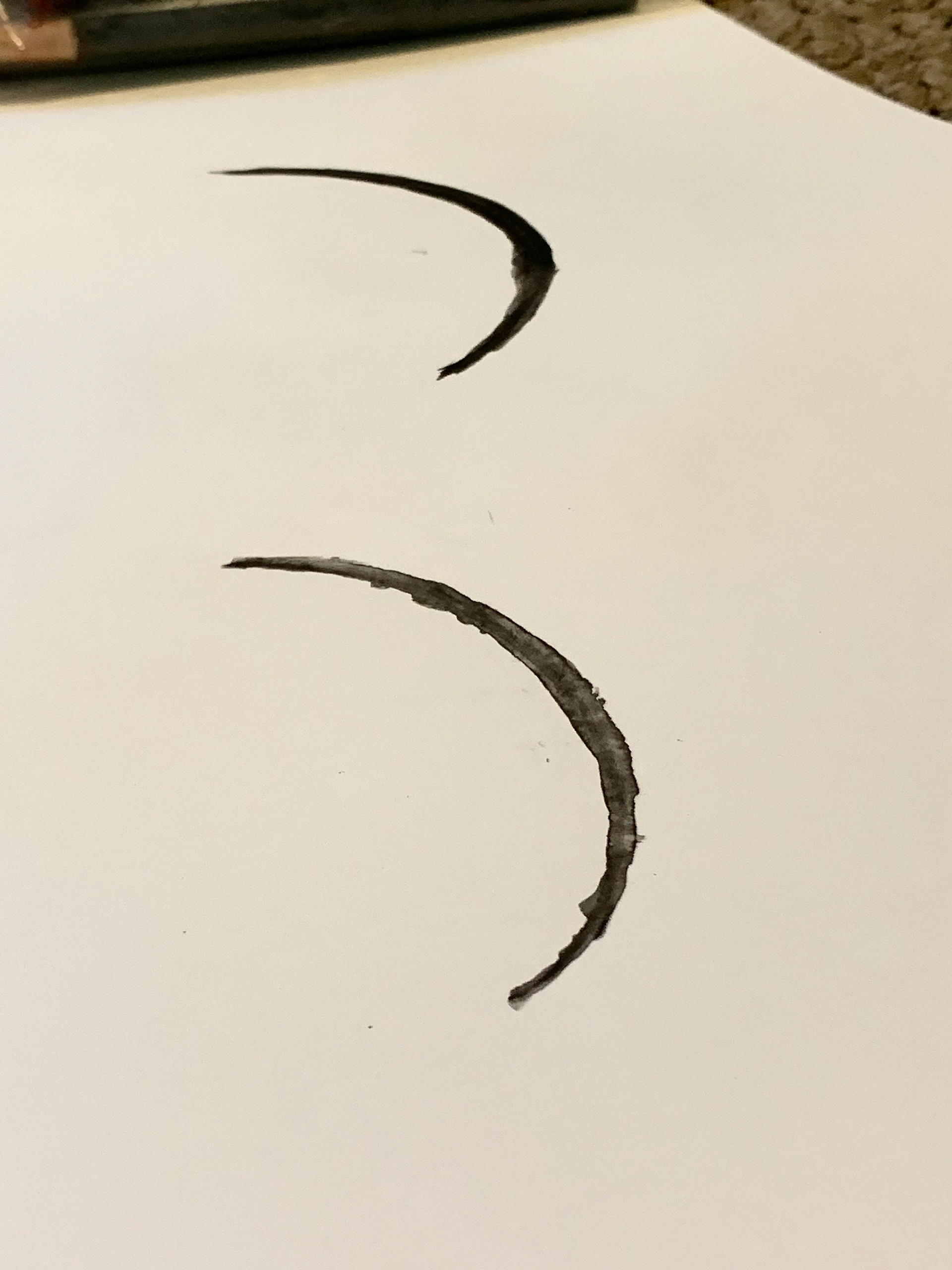
To brand this series, a "fermata" (a musical symbol) was chosen. In music, a fermata is placed over a note instructing the performer to hold that note for an indefinite period of time. Using this as the basis of the logo was to signify that this symphonic series was a temporary holding period while the world waited out the pandemic. But though it was a holding period, it would still be full of life, energy, and music, which is why the watercolor theme was introduced.


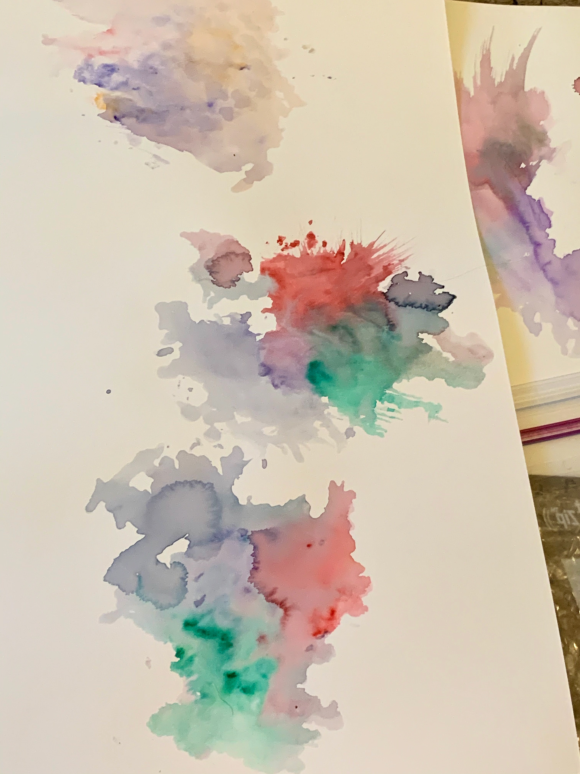
Development of the fermata logo and watercolor background
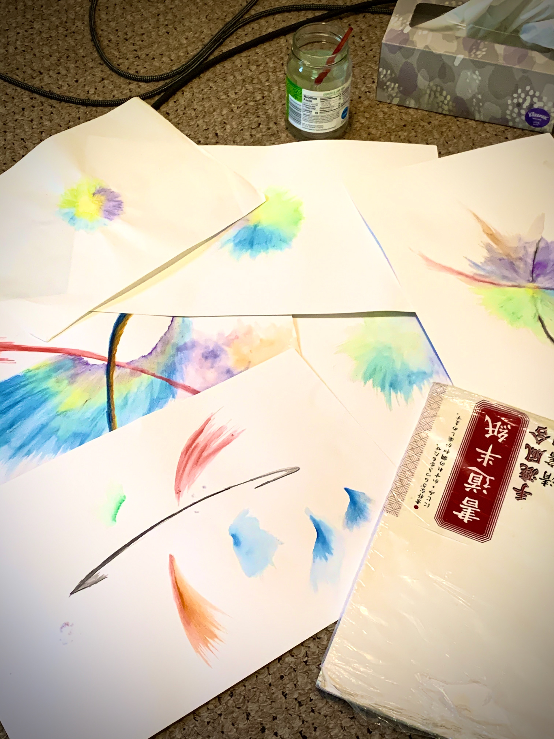
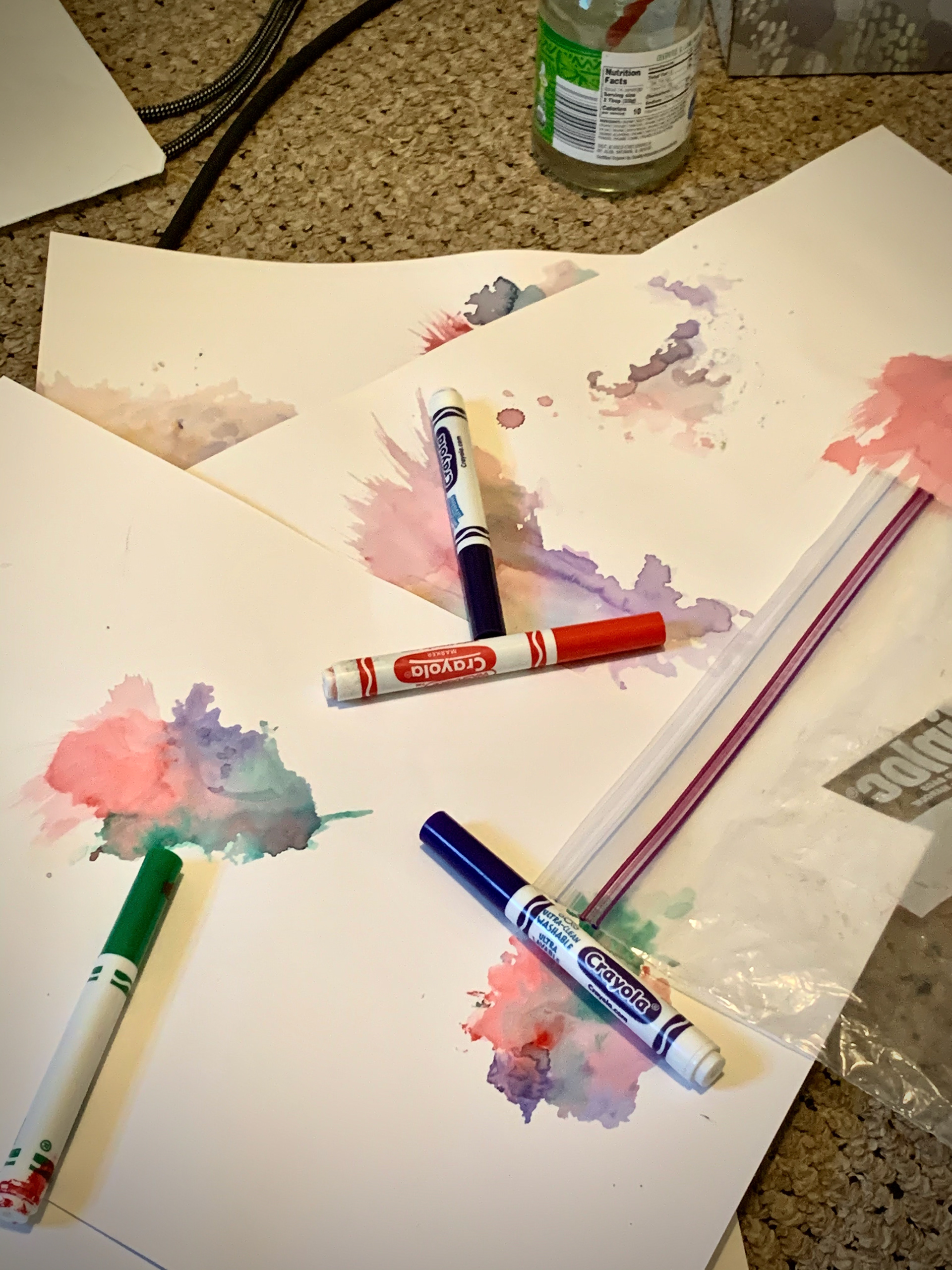
For the watercolor background, I started by using watercolor pencils. But it did not achieve the watercolor wash effect that I was going for. So I ended up taking water-based markers, scribbling out various areas of color on plastic, adding some drops of water, and then pressing the plastic onto the paper. Afterwards, the I scanned the paper and brought it into Photoshop where it could be cropped and edited.


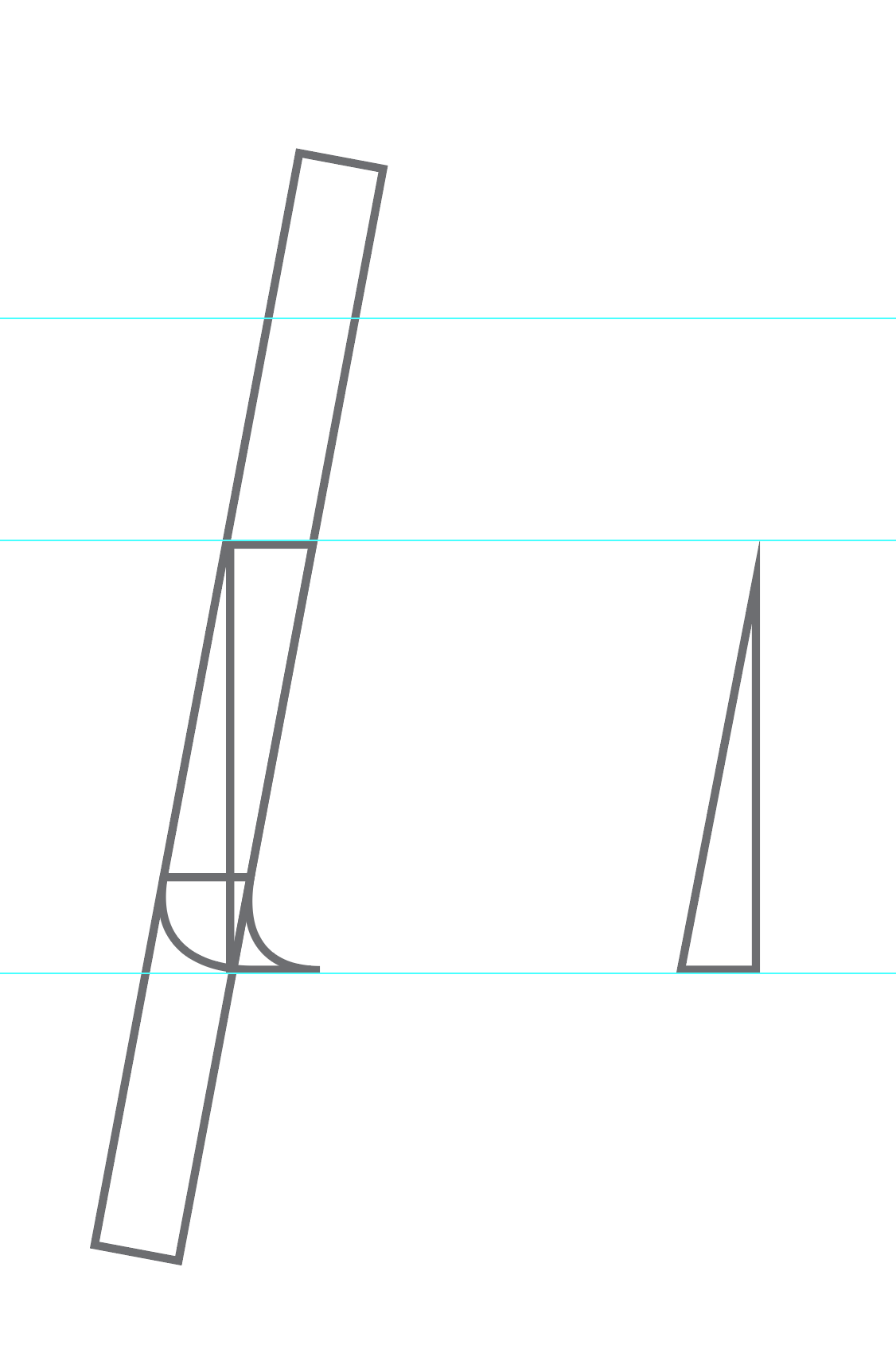
Custom title font
I couldn't quite find a font that was both formal and elegant, while also matching the ASO logo (the small orchestra conductor pictograph) as well as the watercolor feel. So for the "interlude" title, I created my own custom type.


Final Poster Design


Additional sketches
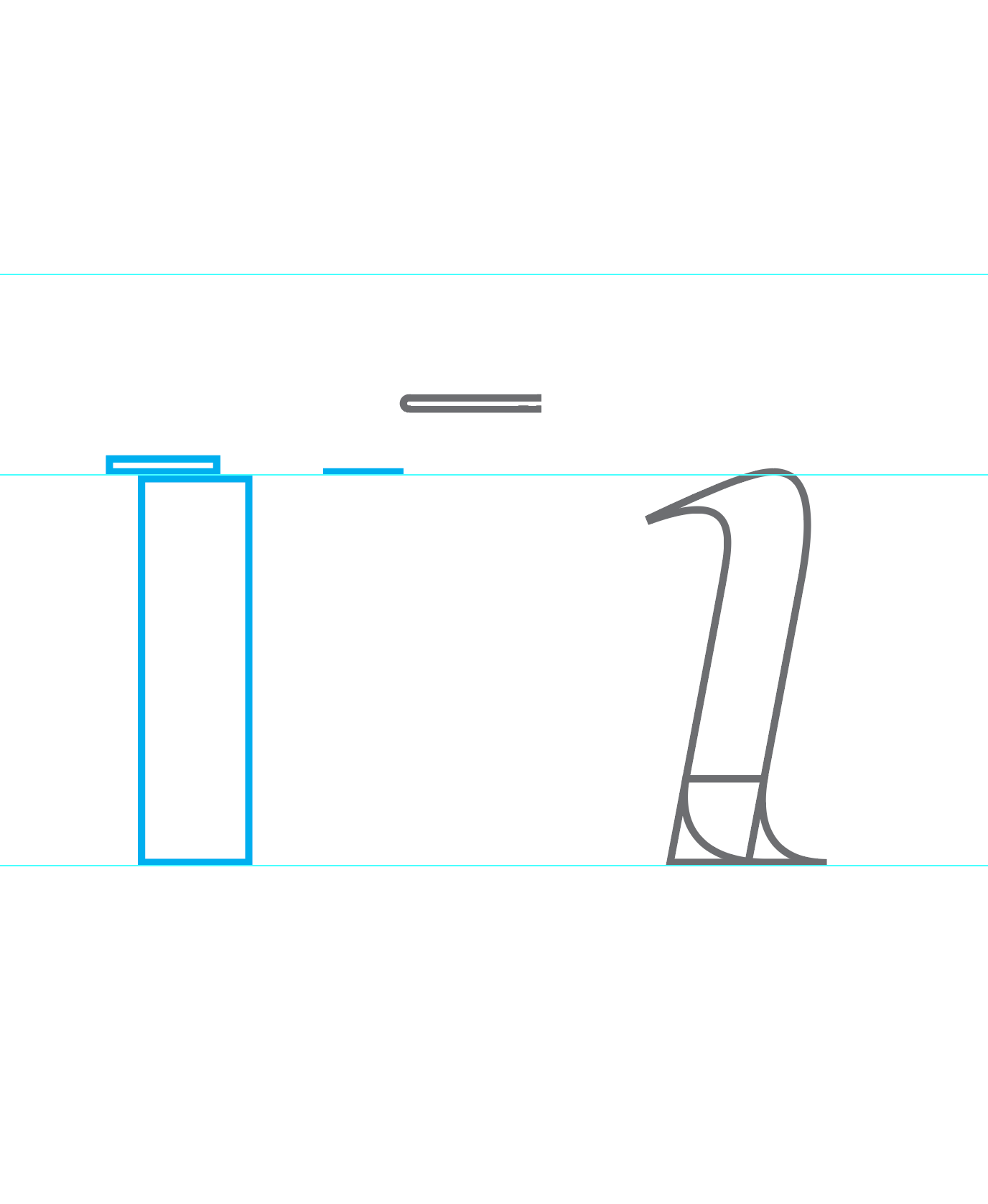
Initially, other elements were explored, such as musical rest symbols and the Akron city skyline, but ultimately were discarded.